M.E.T.R.O

Hitcore

Well-known member
Joined
11 Feb 2025
Messages
428 (2.49/day)
Location
Energiehal
First there was R.E.T.R.O. Now there is M.E.T.R.O:

To view this content we will need your consent to set third party cookies.
For more detailed information, see our cookies page.

This awesome backronym -- M.E.T.R.O -- stands for Met Een Teringvaart Rotterdam Onderdoor.
Now this is somewhat Rotterdam slang, there is no literal translation that would make sense, roughly it means something like "blazing under Rotterdam like hell".

The music and effects I made as 90s as possible, while the footage is from the 60s, 70s, 80s, and 90s, though heavily edited. Only the old rolling stock, only the old style stations! The aesthetics of the current rolling stock and stations have lost their charms in the 21st century after extensive modernization (like most things).

Enjoy!
 

Retro

Founder
Staff Member
Joined
4 Jun 2021
Messages
6,978 (4.59/day)
Location
UK
I like it, another banging tune and interesting video! You have a very distinctive sound, Hitcore. :cool:

Now this is somewhat Rotterdam slang, there is no literal translation that would make sense, roughly it means something like "blazing under Rotterdam like hell".
Isn't it interesting how some concepts and meanings cannot be translated from one language to another? Shows how language can enable concepts, ideas and meanings to be expressed while also limiting what can be expressed and we're not even aware of it as we're trapped within its confines. I wonder what a language that would allow the most expression be like.

Ok, I confess that my favourite part of the video is the couple of seconds showing the points switch. Doesn't get much nerdier than that! Generally, I like photos and videos showing complex track arrangements with lots of points and crossings and even better when trains are moving across them. Yes, I like trains. There, I've said it!

Finally, could you please post a photo or two or a video of the modern rolling stock and stations for comparison? I'm really curious to know how it's changed.
 

Hitcore

Well-known member
Joined
11 Feb 2025
Messages
428 (2.49/day)
Location
Energiehal
I like it, another banging tune and interesting video! You have a very distinctive sound, Hitcore. :cool:
Thank you so much, Retro. I'll admit that I needed to read those words. 🙏

Shows how language can enable concepts, ideas and meanings to be expressed while also limiting what can be expressed and we're not even aware of it as we're trapped within its confines.
Well said! And it is true: some concepts, ideas and meanings can only be fully cultivated in one specific language. As someone who speaks 4 languages and is able to dream in 3 of them: I can first hand tell you that it's not just the words that are different, but also the ways of thinking and conceptualizing can differ greatly.

IN FACT... this goes even so far that I can say that I am somewhat of a different person depending on what language I speak. In Dutch I can be an absolute barsteward. While Danish tends to bring the politest version out of me.

I wonder what a language that would allow the most expression be like.
English I have always found to be a surprisingly versatile language. This goes even so far that meanings and idioms are often unique to British English, American English, Australian English, etc. etc., respectively. I have also noticed that dictionaries in English usually are thicker than in lots of other languages. English is an awesome language, and I always enjoy speaking or writing it.

Ok, I confess that my favourite part of the video is the couple of seconds showing the points switch. Doesn't get much nerdier than that!
My fellow train nerd! 🤓🤓

Finally, could you please post a photo or two or a video of the modern rolling stock and stations for comparison? I'm really curious to know how it's changed.

Sure! Just give me a bit of time to scrape a couple of comparable photos together, I'll try to find photos of the same locations, so that we can get some good before and after comparisons!
 

Hitcore

Well-known member
Joined
11 Feb 2025
Messages
428 (2.49/day)
Location
Energiehal
Alright, let's look at three stations.
Two of them will be on the east/west line (opened in 1982) and one on the north/south line (opened in 1968)

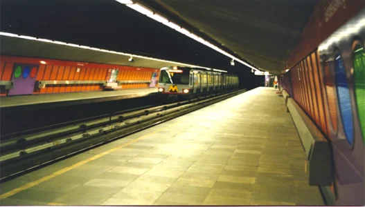
This station: Gerdesiaweg (east/west):

1982-peter-vink-01_orig.webp
Each station on the east/west line had its own color accents. Gerdesiaweg had purple. And there were always some other colors present too. The orange walls were actually glass, with a pattern if you looked at them from really close. Stylish!

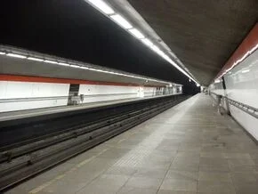
290px-Gerdesiaweg_perron.webp
Almost the exact same spot, maybe a few meters back. The color is gone, only a red edge. Most stations have these white walls now. Individuality got replaced with uniformity, how 21st century. They're made of hard plastic and feel cheap.

And the next station hurts even more to see the difference...

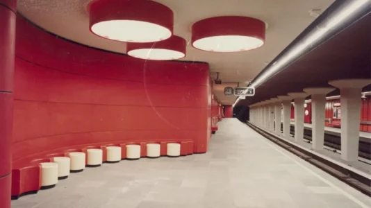
This station: Churchillplein (old name) / Beurs (new name)

ac96d307-0ea0-41be-8a56-75c5901b1381_thumb1440.webp
Just look at this. This is gorgeous. I remember sitting on those white round things, they were quite unique. Love that lighting too. Maximum coziness!

sddefault.webp
The opposite platform but the same station. Again with the white plastic walls. Stripped of all its personality. Generic cookie cutter metro too, that type probably operates in a few dozen other cities as well.

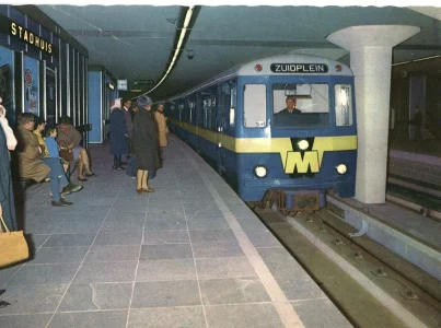
Station: Stadhuis (meaning: City Hall) (north/south)

0802metro2.webp
Lots of blue here, both the station and the metro. While the layout of the station is simple, its materials are classy (blue glass panels with stainless steel frames). Love the sign's font too. Classy.

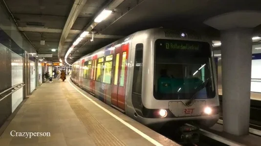
hq720 (1).webp
Opposite platform again, but whatever. Again with the white panels, though it has a few darker ones as well. I guess because this is where city hall is they really wanted to go super fancy for this one. 😏

Next post some more about the rolling stock!
 

Retro

Founder
Staff Member
Joined
4 Jun 2021
Messages
6,978 (4.59/day)
Location
UK
Yeah, I see what you mean. It's cost-cutting bland isn't it? Clearly the stations needed a makeover at some point due to aging so they worked out the cheapest way to do it. I can see why you based your video on the original versions and I would too.

Love the sign's font too. Classy.
Agreed, a very retro modern monospaced font that's easy to read. Looks like that picture was taken in the 70s or 80s judging by the film grain and overall look of the picture.
 

Hitcore

Well-known member
Joined
11 Feb 2025
Messages
428 (2.49/day)
Location
Energiehal
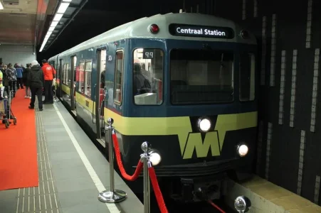
2018-02-09 50 jaar Metro (55).webp
Type M. Delivered in 1966 (two years before the opening). Made it all the way to 2002. This picture is from 2018, where the last remaining Type M was displayed for the 50th anniversary of the Rotterdam Metro. I love the design of this, with the iconic "yellow mustache", as we called it. To me this is the definition of what a metro should look like.

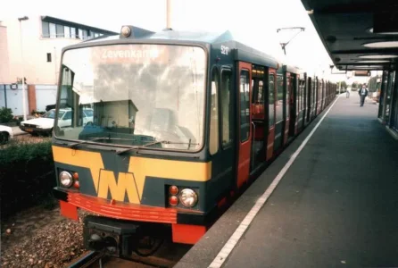
Mk_Rotterdam_Metro_1.webp

Type T. Delivered in 1981 (I think), a year before the east/west line's opening. On a technical level quite similar to the Type M, but this type not only had a third rail arm but it also had a pantograph, for street level service. In the mid 2000s it got revised and had a new color (grey/silver) to match the newer stock's generic looks (gotta have that uniformity). Type T went on until like 2017, if I remember correctly.

legerstee4.webp
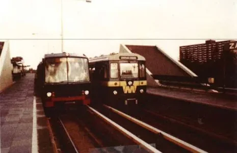
Bonus picture! Since Type M was mainly used for the north/south line and Type T mainly for east/west, it was rare to see them together like this. And even rarer to see them connected, though it was possible due to the technical similarities. This picture must be from the early to mid 80s because the Type T didn't have its yellow mustache here yet (that type received that a few years later).

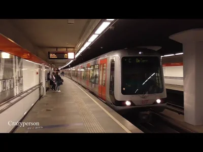
hq720.webp
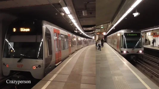
The one on the right you've seen in some of the other pictures, that's Type B. From around the year 2000 I think, to replace the Type M. The one on the left is the replacement of Type T. I don't even know what letter they have assigned to that type. It was delivered in the mid 2010s.
Lots of plastic in these things. I think Fischer Price made them.
 

Hitcore

Well-known member
Joined
11 Feb 2025
Messages
428 (2.49/day)
Location
Energiehal
It's cost-cutting bland isn't it? Clearly the stations needed a makeover at some point due to aging so they worked out the cheapest way to do it.
Yep, you got that right.

Looks like that picture was taken in the 70s or 80s judging by the film grain and overall look of the picture.
Indeed, early to mid 70s I'd say.

Oh man, it's not just the metro system. All of the city changed so rapidly over the past few decades. So much charm is gone, forever. I could write so many posts about it. Maybe some day, not in this thread.
 

Hitcore

Well-known member
Joined
11 Feb 2025
Messages
428 (2.49/day)
Location
Energiehal
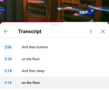
YouTube's automated transcript interpretation of "Met Een Teringvaart Rotterdam Onderdoor" is.... quite something else. 1000018413.gif

1000018355.webp
 
Back
Top Bottom