A few years back, an ambitious coder made a complete conversion of Street Fighter for the SAM Coupé in honour of the game's 30th Anniversary. Considering it's based on the Amiga/Atari ST conversion by Tiertex, it's not bad - about as playable as their 16-bit versions. Graphically, it's a 1:1 conversion from the Amiga (16 colour mode), with the sounds/music coming from the ST version. It even takes advantage of the 1Mb RAM box to remove the need for multi-loading and to deliver 2-layer backgrounds: the skies don't scroll like they do on the arcade, but everything in front of the sky scrolls independently of it when moving around each stage.
Problem is, Tiertex had done their usual lazy, shoddy job, and it wasn't as good-looking as it should have been on the 16 bit machines. This, naturally, carried over to the SAM conversion. The original palette uses something like 7 skin/brick tones, 4 shades of blue (2 of which translated poorly to the SAM, turning purple), 2 shades of grey, then a single red, and rounded off with Black and White. They also cut five of the match backgrounds - the second from each country - so the opponents didn't all have their own unique arenas. Two of the Bonus Stages were edited out entirely, the map was removed and they didn't bother with any of the fighters' portraits, substituting the in-game sprite for all the between-match info screens.
Perhaps the weirdest thing is that Street Fighter didn't have an overabundance of animation in the arcade game - not a patch on the sequel - Ryu had about 75 frames IN TOTAL, with all the others (bar Ken) having far fewer. Even so, Tiertex cut down the animations, so the somersault had about 2 frames of animation versus the arcade's 4, and Ryu's 'walk-on' animation for each stage (a whole 6 frames) was deemed redundant. Perhaps their worst transgression was giving all the sprites black outlines to ensure they stood out against the flat backgrounds.
On a bit of a whim yesterday, I nabbed all the battle stage backdrops from the arcade version and ran them through Photoshop to apply an optimised 16-colour palette (the closest possible SAM analogue to DawnBringer's) just to see what came out.

Lots of experimentation was required to get the appropriate level of dithering, with some requiring two separate passes - one for the foreground, one for the background (skies in particular were troublesome).
Here are the results:
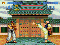
A mockup of the screen cropped to 256x192 pixels, with the background and both fighters using the same palette of 16 colours. On a modern LCD screen, the background looks pretty grainy... But I think it'd probably look great on a CRT.
The sprites shown are 1:1 transfers from the arcade game (Ryu stands a colossal 92px tall) with the colours manually trimmed down, since each fighter had a unique palette of circa 16 colours. Some turned out better than others, but still way better than Tiertex's efforts at redrawing the sprites for the home computers (Ryu becoming 80px tall).
And now for the backgrounds... As mentioned, all of these are derived from the arcade graphics, and all I've done is reduce them to the 16 colours of the optimised palette shown above, using Photoshop's Indexed Colour options, then trimmed them vertically to 192px tall.
China #1

China #2

England #1

England #2

Japan #1

Japan #2

USA #1

USA #2

Thailand #1

Thailand #2

I've no idea whether it would be feasible to 'remix' the existing SAM conversion, to add in new graphics... but would be cool if possible. Been looking at some other arcade games as well - kind of amazing what this optimised 16-colour palette can adapt itself to...
Problem is, Tiertex had done their usual lazy, shoddy job, and it wasn't as good-looking as it should have been on the 16 bit machines. This, naturally, carried over to the SAM conversion. The original palette uses something like 7 skin/brick tones, 4 shades of blue (2 of which translated poorly to the SAM, turning purple), 2 shades of grey, then a single red, and rounded off with Black and White. They also cut five of the match backgrounds - the second from each country - so the opponents didn't all have their own unique arenas. Two of the Bonus Stages were edited out entirely, the map was removed and they didn't bother with any of the fighters' portraits, substituting the in-game sprite for all the between-match info screens.
Perhaps the weirdest thing is that Street Fighter didn't have an overabundance of animation in the arcade game - not a patch on the sequel - Ryu had about 75 frames IN TOTAL, with all the others (bar Ken) having far fewer. Even so, Tiertex cut down the animations, so the somersault had about 2 frames of animation versus the arcade's 4, and Ryu's 'walk-on' animation for each stage (a whole 6 frames) was deemed redundant. Perhaps their worst transgression was giving all the sprites black outlines to ensure they stood out against the flat backgrounds.
On a bit of a whim yesterday, I nabbed all the battle stage backdrops from the arcade version and ran them through Photoshop to apply an optimised 16-colour palette (the closest possible SAM analogue to DawnBringer's) just to see what came out.
Lots of experimentation was required to get the appropriate level of dithering, with some requiring two separate passes - one for the foreground, one for the background (skies in particular were troublesome).
Here are the results:

A mockup of the screen cropped to 256x192 pixels, with the background and both fighters using the same palette of 16 colours. On a modern LCD screen, the background looks pretty grainy... But I think it'd probably look great on a CRT.
The sprites shown are 1:1 transfers from the arcade game (Ryu stands a colossal 92px tall) with the colours manually trimmed down, since each fighter had a unique palette of circa 16 colours. Some turned out better than others, but still way better than Tiertex's efforts at redrawing the sprites for the home computers (Ryu becoming 80px tall).
And now for the backgrounds... As mentioned, all of these are derived from the arcade graphics, and all I've done is reduce them to the 16 colours of the optimised palette shown above, using Photoshop's Indexed Colour options, then trimmed them vertically to 192px tall.
China #1

China #2

England #1

England #2

Japan #1

Japan #2

USA #1

USA #2

Thailand #1

Thailand #2

I've no idea whether it would be feasible to 'remix' the existing SAM conversion, to add in new graphics... but would be cool if possible. Been looking at some other arcade games as well - kind of amazing what this optimised 16-colour palette can adapt itself to...

